Introduction
In the digital age, a well-designed website is no longer a luxury, but a necessity. Whether you’re a business owner, a marketer, or a web designer, understanding the principles of modern web design is crucial for success online. This blog post will uncover the 15 principles that form the foundation of web design today, and how they work to create user-friendly and aesthetically pleasing websites.
1. Simplicity is Key
“Less is more” is a principle that holds true in many areas of life, including web design. Simplicity in web design means eliminating all non-essential elements and focusing on what truly matters. This style of web design aims to provide a clear and direct user experience, eliminating confusion and promoting user engagement.
A simple web design isn’t about being sparse, minimal, or devoid of color or images. Instead, it’s about judicious use of elements to create a clean, uncluttered, and intuitive design.
Elements of Simple Web Design
- Clean Layout: A simple web design starts with a clean, uncluttered layout. It provides a clear structure for the content, guiding the viewer’s eye and making navigation intuitive.
- Use of White Space: White space, or negative space, is a critical component of simple web design. It provides visual breathing room for the eye, making content more readable and the layout easier to navigate.
- Simple Navigation: A straightforward and intuitive navigation menu makes it easy for users to find what they’re looking for. This could mean having a fixed top navigation bar, a hamburger menu, or a single-page layout with anchor links.
- Clear Typography: Clear, legible fonts contribute to a site’s simplicity. Sans-serif fonts are often a popular choice due to their readability, but the key is to stick to a few complementary fonts and use them consistently across the site.
- Consistent Color Scheme: A simple web design often features a limited color palette, with one or two primary colors and one or two secondary colors. This not only gives the site a professional and cohesive look but also guides the user’s eye to important elements.
- Quality Images: Using high-quality, relevant images in moderation can enhance a simple web design. Whether they’re product photos, team pictures, or hero images, they should be clean, clear, and purposeful.
- Clear Calls-to-Action (CTAs): Simple web design aims to guide users to complete a specific action, whether that’s making a purchase, signing up for a newsletter, or filling out a contact form. Clear, compelling CTAs can guide the user towards this goal.
Benefits of Simple Web Design
Simple web design offers several advantages:
- Improved User Experience: By reducing clutter and focusing on essential elements, simple web design makes it easier for users to navigate the site and find the information they need.
- Faster Load Times: Websites with simple designs typically load faster as they have fewer elements and smaller file sizes. Faster load times can improve user experience and SEO.
- Mobile-Friendly: Simple designs usually translate better to smaller screens, making the site more mobile-friendly.
- Professional Appearance: A clean, simple design can give your site a professional, modern appearance, enhancing your brand image and credibility.
2. Consistency Counts
Consistency in a website involves ensuring a uniform style and appearance across all pages. This includes maintaining the same color scheme, typography, button styles, and layout structures throughout. Consistency makes your website look professional and cohesive, which enhances usability and strengthens your brand identity.
Elements of Consistent Web Design
- Layout and Structure: Keeping a consistent layout across your website helps users know where to look for certain types of information. This involves maintaining the same position for elements like the logo, navigation menu, and footer across all pages.
- Typography: Typography plays a critical role in creating a visual hierarchy and guiding the reader through your content. Using a consistent set of fonts throughout your site helps maintain a cohesive look and feel.
- Color Palette: Your color scheme should be consistent across all webpages. These colors should align with your brand identity and be used consistently for specific elements (like CTAs, links, or headings).
- Images and Icons: Use a consistent style for your images and icons. This doesn’t mean every image needs to look the same, but they should feel like they belong together. This can be achieved through using the same filter for your images or using icons from the same set.
- Navigation: The navigation system should remain consistent across the website. If you use a top navigation bar on one page, it should appear on all other pages. This helps users learn how to navigate your site quickly and efficiently.
- Buttons and CTAs: The design of buttons and CTAs should remain consistent. This includes their color, typography, shape, and hover effects. This helps users quickly identify interactive elements.
3. Prioritize User Experience (UX)
User Experience (UX) in website design is all about creating a site that provides a seamless, efficient, and enjoyable experience for the user. It’s the process of enhancing user satisfaction by improving the usability, accessibility, and interaction between the user and the product or service.
Elements of User Experience in Website Design
- Usability: This involves creating an intuitive and straightforward website that even the most non-tech savvy user can navigate without encountering difficulties.
- Information Architecture: This is the structural design of shared information environments. It involves organizing and labeling websites to support usability and findability.
- Interaction Design: This is about creating engaging interactive systems with well thought out behaviors. Good interaction design makes it easy for users to accomplish their objectives on your website.
- Accessibility: It’s critical that a website is accessible to all users, regardless of their abilities. This includes designing for people with visual impairments, hearing impairments, and physical disabilities, among others.
- Visual Design: This pertains to the aesthetics of the website. It should be appealing and organized in a way that directs the user’s attention to important elements.
4. Embrace Responsive Design
Responsive design is a web design approach that makes web pages render well on a variety of devices and window or screen sizes. It involves designing a website so that its layout, images, and styling can adjust automatically to fit the device on which it is viewed.
As more people use smartphones and tablets to access the internet, responsive design has become increasingly important. It ensures that users have a seamless browsing experience, regardless of whether they’re using a desktop computer, laptop, tablet, or mobile phone.
The responsive design considers factors like screen resolution, pixel density, and touch vs. click interfaces, adapting the site to meet these variables. This flexible, fluid approach to web design not only enhances user experience, but it also has SEO benefits, as Google tends to favor mobile-friendly websites in its search results.
In essence, responsive design is about providing the best possible browsing experience for the user, regardless of the device they’re using.
5. Color Psychology Matters
Color psychology refers to the study of hues as a determinant of human behavior. In web design, understanding color psychology means using colors to influence how users perceive a brand, impact their emotions, and guide their behavior on a website.
Each color has different psychological implications and can trigger certain emotions. For instance, red is often associated with passion and urgency, blue conveys trust and stability, green is linked with peace and nature, yellow symbolizes happiness and creativity, and black exudes luxury and sophistication.
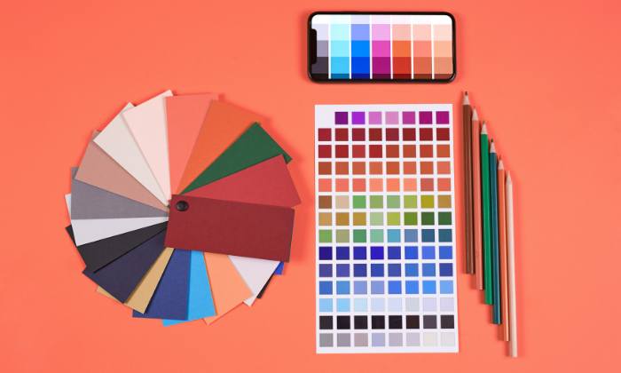
Using color psychology in web design involves choosing a color scheme that reflects your brand’s personality and values, while also considering the emotional impact these colors might have on your target audience. It’s also important to consider cultural differences in color associations as they can vary widely.
By using color psychology, web designers can guide users’ attention to specific areas of a site, evoke emotional responses, and influence users’ interactions and conversions. In a nutshell, understanding and leveraging color psychology is a powerful tool in creating an effective, engaging, and impactful web design.
6. Prioritize Speed
Website speed and web design are intrinsically linked. The design decisions made when building a website can significantly impact its loading speed, which in turn affects user experience, search engine rankings, and overall website performance.
Complex design elements, high-resolution images, excessive use of JavaScript, and unoptimized code can all slow down a website. In contrast, a clean, simple design with optimized images, streamlined code, and efficient use of CSS and JavaScript can improve website speed significantly.

A fast-loading website is essential in today’s digital landscape, as users often leave pages that take too long to load. Moreover, Google includes page speed in its ranking algorithm, meaning a slow site may rank lower in search results.
In conclusion, web design plays a crucial role in website speed, which subsequently impacts user experience and SEO performance. Therefore, it’s essential to consider speed during the web design process and to make design decisions that contribute to a fast, efficient website.
7. Typography Speaks Volumes
Typography is a critical component of web design. It can influence the way information is perceived and absorbed by the user, making it a powerful tool for communication.
The right typography enhances readability, ensures a good user experience, and significantly impacts the overall aesthetic of a website. It aids in creating a visual hierarchy, guiding users through the content, and highlighting key information.
Different fonts can evoke various emotions and associations. Serif fonts, for instance, are often associated with tradition and reliability, while sans-serif fonts suggest modernity and simplicity. The choice of font should reflect the brand’s identity and the message it wants to convey.
Additionally, size, line height, spacing, and color all play a part in how easily text can be read and understood. A well-considered typographic design ensures that website content is accessible and enjoyable to read, leading to longer website visits and higher user engagement.
In short, the right typography in web design is fundamental for communicating effectively with your audience, making your website more user-friendly, and enhancing your brand’s overall online presence.
8. Implement F-Layout and Z-Layout
The F-Layout and Z-Layout are two commonly used patterns in web design, based on how users typically scan content on a webpage.
-
F-Layout:
The F-Layout follows the natural eye movement of users when they read content, which is typically in an ‘F’ pattern. Users first read from left to right across the top, forming the upper bar of the ‘F’. Then, they scan down the page vertically, creating the spine of the ‘F’. If something catches their interest, they read from left to right again, forming the lower bar of the ‘F’. To leverage this pattern, key information and calls-to-action should be placed along the F’s path, with less important content positioned in the lower parts of the page.
-
Z-Layout:
The Z-Layout is commonly used for pages that don’t contain a lot of information, such as landing pages or simple home pages. As the name implies, users scan these pages in a ‘Z’ pattern. They start at the top left, move their eyes from left to right, then diagonally down to the left, and finally from left to right again. Critical elements like logos, headlines, CTAs should be placed along the Z’s path for maximum visibility and engagement.
Both these layouts are based on natural reading patterns and can be effective in guiding users’ attention to crucial elements of the website, thereby improving usability and conversion rates. Designers should choose the layout that best fits their content and user needs.
9. Utilize White Space
White space, or negative space, refers to the empty spaces around and between elements on a page. It gives design elements room to breathe, enhancing readability, focus, and understanding. White space can also help guide users through your site, drawing attention to key elements.
10. Use High-Quality Images
High-quality images play a significant role in web design, impacting both the aesthetics and functionality of a website. They can convey messages quickly and powerfully, enhance user engagement, and contribute to the overall user experience.
-
Aesthetics:
High-quality images can significantly improve a website’s visual appeal. They can convey emotions, set the tone, and complement the color scheme and branding of a site.
-
User Engagement:
Images can quickly grab user attention and make content more digestible and engaging. A compelling image can draw users in, encourage them to stay longer, and increase the likelihood of them taking a desired action.
-
Professionalism and Credibility:
High-quality, professionally shot and edited images can convey a sense of professionalism and credibility, enhancing the overall brand image.
-
SEO:
When properly optimized (with relevant file names, alt tags, etc.), high-quality images can also contribute to a site’s SEO, making it more discoverable in image search results.
However, it’s important to remember that while high-quality images are important, they also need to be optimized for web use. Large image files can slow down a site’s load time, negatively impacting the user experience and SEO. Using the right file format, compressing images, and implementing responsive image techniques can help maintain a balance between image quality and website performance.
11. Apply Hick’s Law
Hick’s Law, named after British psychologist William Edmund Hick, is a psychological principle that states that the time it takes for an individual to make a decision increases with the number and complexity of choices. This law has significant implications in the field of web design.
In the context of web design, Hick’s Law can be interpreted to mean that the more options presented to website users, the longer it will take them to make a decision. This can lead to decision paralysis, where users may feel overwhelmed and choose not to make a decision at all, leading to lower conversion rates.
To utilize Hick’s Law effectively in web design, it’s important to minimize the number of choices presented to users at any given time. This can be achieved by simplifying navigation menus, categorizing options, and using progressive disclosure to show users only what they need to see at any given moment.
A popular example of the application of Hick’s Law in web design is on landing pages, where typically a single primary action is encouraged, such as signing up for a newsletter or making a purchase.
In essence, Hick’s Law is a reminder to keep designs as simple as possible to make it easier for users to make decisions and engage with your website.
12. Design for Accessibility
Web accessibility means designing and developing websites that people with disabilities can use. This includes providing text alternatives for non-text content, making all functionality available from a keyboard, and avoiding designs that are known to cause seizures. Designing for accessibility not only opens your website up to a wider audience but can also improve SEO and usability for all users.
13. Incorporate Social Proof
Social proof, like testimonials, reviews, or case studies, can be a powerful persuasion tool. By showing that other people trust and use your product or service, you build trust with your website visitors and encourage them to convert. Social proof can take various forms on a website, from a dedicated testimonials page to reviews on product pages.
14. Optimize for SEO
Search engine optimization (SEO) involves various practices designed to improve a website’s visibility in search engine results pages (SERPs). For web design, this means creating a site that’s easy for search engine bots to crawl and understand, using SEO-friendly URLs, and incorporating relevant keywords in your content and meta tags. Good SEO design also involves ensuring your site is fast and mobile-friendly.
15. Encourage User Interaction
User interaction in web design might involve interactive elements like buttons, forms, sliders, or chatbots. These elements engage users, providing a more immersive experience and encouraging them to spend more time on your site. This could also lead to higher conversion rates, as users who interact with your site are more likely to feel engaged with your brand.
Elements of User Interaction in Web Design
- Feedback: Websites should provide feedback in response to user actions. For example, when a user clicks a button, the button might change color, indicating that the click was successful.
- Consistency: The design should be consistent across all pages of a website, making it easy for users to learn how to interact with the website.
- Ease of Use: The website should be easy to use, allowing users to accomplish their goals quickly and easily.
- Affordances: These are visual cues that tell users how they can interact with various elements on the page. For example, a button that appears raised might suggest to users that they can click on it.
- Error Prevention and Handling: Good interaction design helps prevent errors and handles them gracefully when they do occur. For example, form validation can prevent users from entering data in the wrong format.
Conclusion
Adopting these 15 principles of modern web design can significantly enhance your website’s appeal and effectiveness. Remember, web design is not just about aesthetics, but also functionality and user experience. The key is to create a balanced, user-centric design that aligns with your brand’s vision and objectives.
Remember that these principles are guidelines, not rules set in stone. The unique needs of your business, brand, and target audience may require adaptations and innovations beyond these fundamentals. Keep exploring, learning, and testing to keep up with the ever-evolving world of web design.